
To create the website of my visualisation, I started to make a mockup with Sketch.

My idea is to have a menu bar on top and the content in the centre.
The user can interact with the visualisation clicking the buttons on the top to choose between the different sorts.
After having made this quick mockup I start to create the actual website.

The final outcome is a bit different from the mockup that I firstly made.
I choose to change the colour from a light blue to a darker green to better distinguish the menu from the bubbles.
With the first button, the user can see all the bubble together.

With the second, he can see the bubble grouped by language.

With the third button, he can see the bubble split into three groups. The first for the active groups, the second for the inactive and the last for the unknown status, because the private groups do not show the last post.
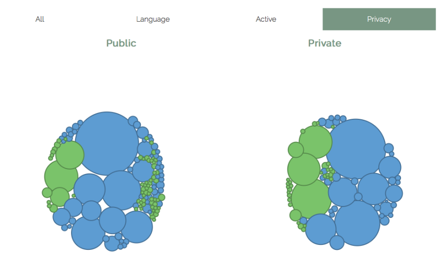
With the last button, the user can see the bubble grouped by privacy, between public and private.

After the visualisation, I wrote an explanation for how first see it and does not know what it is about.
I also added some references to the South Sudan Statistics and the source for the code that I used to make the data visualisation.
